
Type : Article
Release : 25 June 2018
Auteur : Benjamin Dumond
pdf : typographia-hermetica.pdf
apa : Dumond, B. (2018, 25 Jun.). Typographia Hermetica. Grifi.fr. /en/articles/typographia-hermetica
Type design is the discipline that aims to reflect on the form of mechanized writing. The latter is opposed to handwriting, while invading its territory over the years. Today, type represents a significant part of what we consider our writing, one of the most fundamental ways of transmitting knowledge and information. Typography is the interface of the reading process, which transforms an image of a letter into an abstract artifact digested by reflex. From the child reading his first stories, to Matthew Carter himself, everyone is subjected to the shapes of our typefaces. Type nerds may be shocked looking at the kerning of a pair of letters, but when they read, they forget. It is precisely at this moment that the typeface becomes active and operates. This subliminal relationship between the form of the text and the reader is a territory whose borders seem to have been seldom explored.
In the movie Arrival,1 aliens land on Earth and try to communicate with humans through singular unknown symbols. At the end of the movie (spoiler alert), a woman manages to fully understand this writing and integrates it as a commonly spoken language. At this precise moment, this new language totally changes her conception of time and a paradigm shift occurs, leading her to be able to see/live both her future and her past. 2 We then understand that it was not a message, but the writing system itself that the aliens were trying to transmit.
I can't imagine a typeface today being able to achieve more, in terms of function, than time travel. Our capabilities are more limited at the moment. The italic, for example, is a type variation that has the function of calling a second voice, most of the time from outside the main text. It is the external. If we read a text in our head, and we come across a sentence in English composed in italics, we will read it with our inner English accent, with a particular voice. This is a function that the text has acquired over time, and it is not the only one. However, if we exclude the cultural references associated with the design of a typeface, which grants, for example, for a Fraktur the possibility to evoke incunabula, the 3rd Reich, or Metal culture, most of the design variables (weight, width, cases) tend towards a single function: emphasis.
From then on, a question kept staring at me from a dark corner of my head. What lies deep down this new territory whose borders are, on the one hand, a character that allows to alter your conception of time, and on the other, one that allows to call a voice outside the text? A Mariana Trench full of unknown species from which any crypto-typographer would dream of bringing back a specimen.
Obviously, history already had characters that seek to create new functions, or to push the boundaries of what we take for granted. Designers explored and continue to explore the hermetic temples of reading. However, the habit is to analyze a font primarily by the quality of its drawing, and the historical references it invokes. We are captivated by its execution as well as by the logic with which it fits into a historical continuity. Nevertheless, the starting point for an analysis of a typeface could be simpler: what is it that this typeface is trying to do, in terms of function, and how does it achieve it? This inevitably leads to a reconsideration of the concept of typographic heritage, and new links of kinship may emerge, transcending eras, styles and cultures.
It seems to me that I have long been circumspect about the apparent gap between the attention given to character design and the theoretical value it contains. Isn't theorizing and designing writing a major challenge for our civilization? However, we are forced to note the rather passive state in which we are immerged. Character design is rather considered to be a practice, and we have convinced ourselves that we can only undergo, and not write, the history of writing. There is an idea that if changes are to occur, they can only happen very slowly, unbeknownst to the readers and possibly unbeknownst to the type designers themselves. Typography is caught in the trap of its own history and habits. To think outside the given frameworks is now so inconceivable that we prefer to push the idea of family to the extreme, designing superfamily, instead of simply postulating the existence of different family types, our reading habits preventing us from speculating in peace.
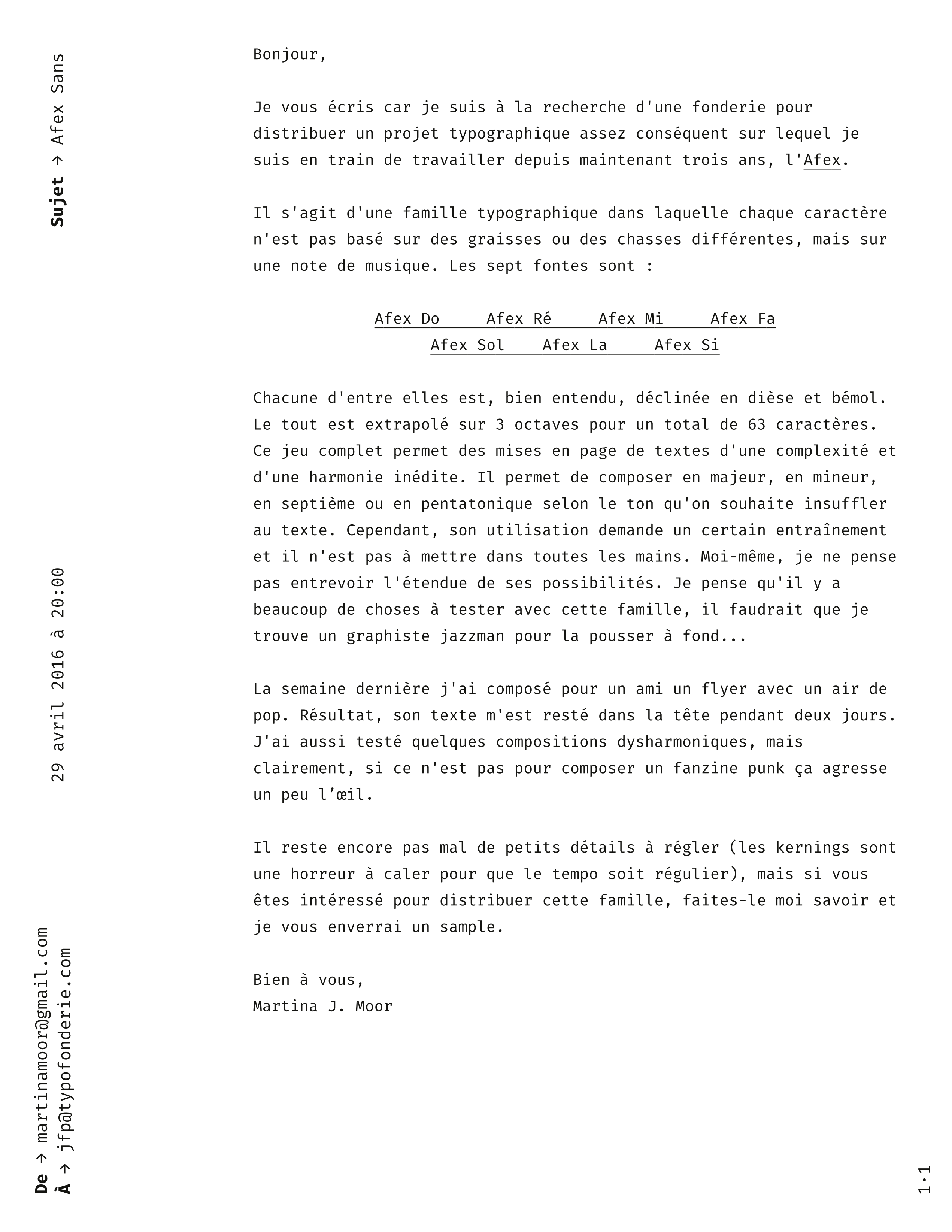
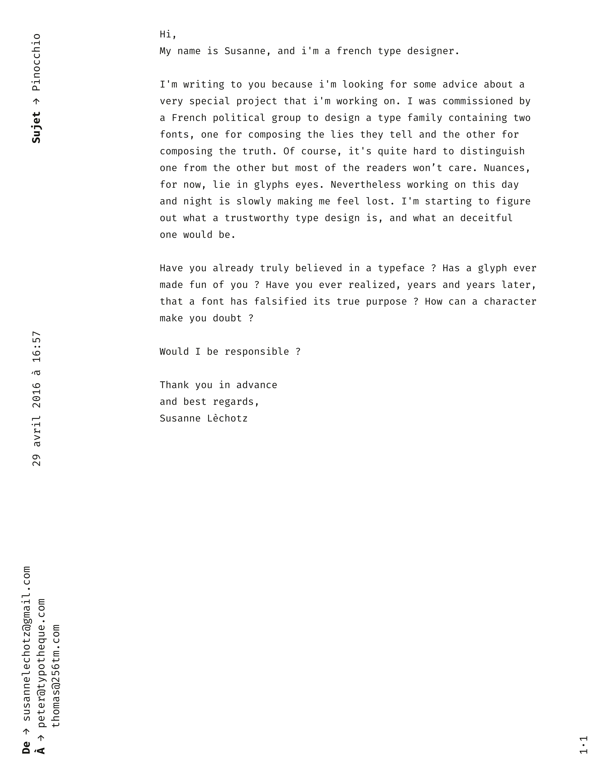
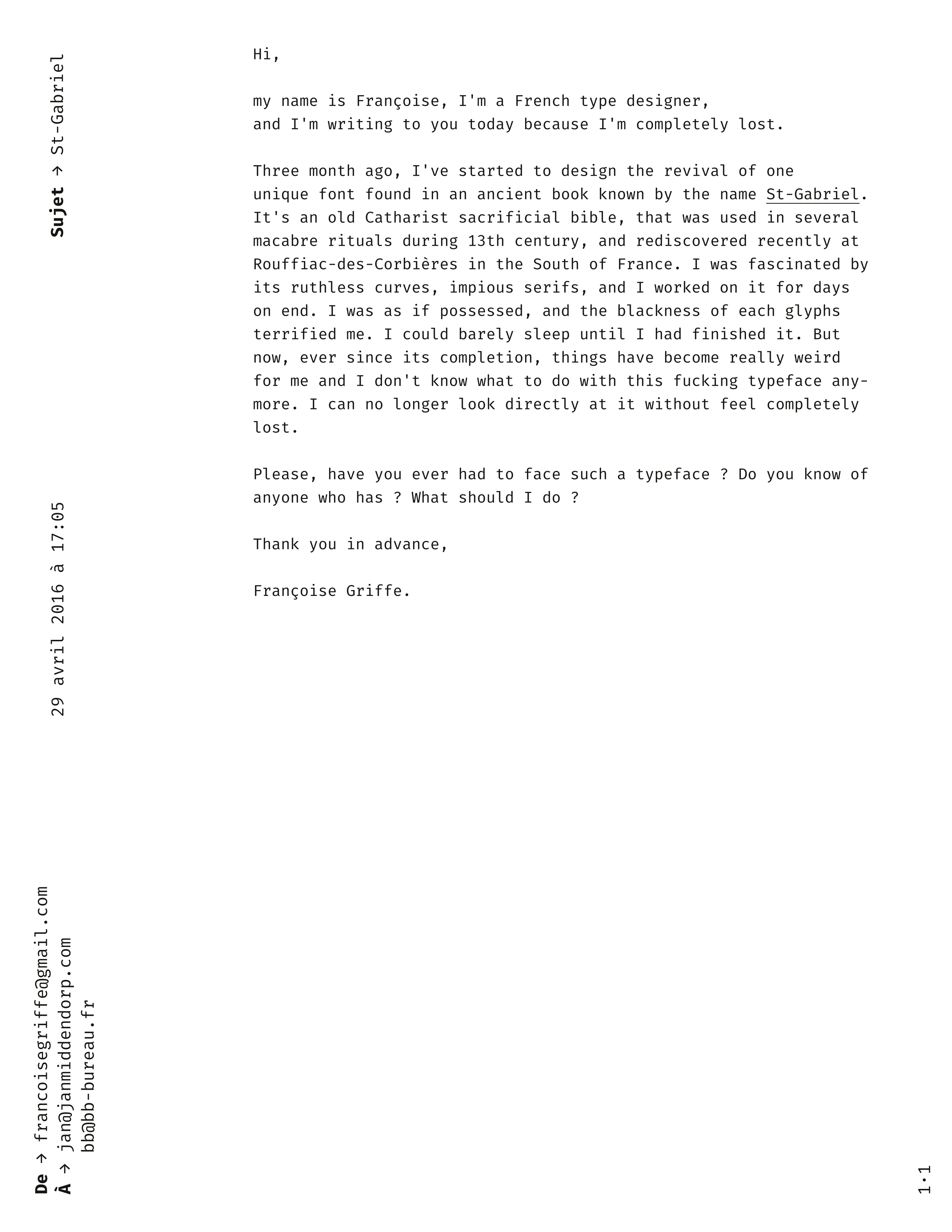
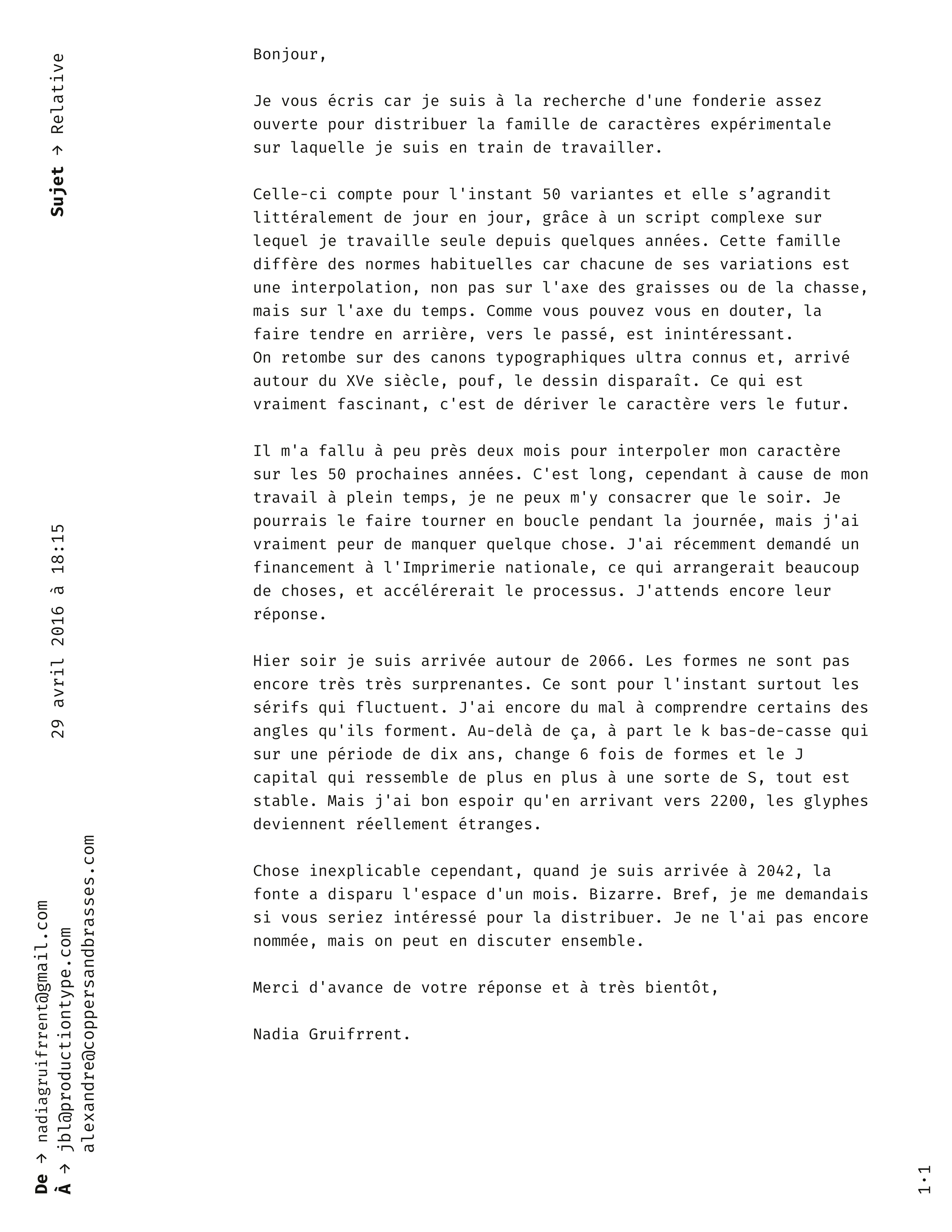
It is in this state of mind that the idea of using fiction as a way to bypass the typographic reality emerged. By giving birth to a typeface only through a story, without any drawings, one becomes a sort of demiurge capable of sending away all the constraints of reality. We enter the space of ethereal typography, where it is possible, for example, to imagine the existence of a typeface capable of driving a reader into madness (and whose obvious use would be to publish a modern version of the Necronomicon), or maybe a disposable typography that can only be used once, or even to speculate on a family with one font to compose the truth and another to compose lies.
If for the average reader this kind of delirium would be just another fiction, but it would be different in the head of the type designer. A moment's distraction from reality, a brief act of alphabetical faith, and he might lose himself into thinking: what if it were possible, how could it be done?
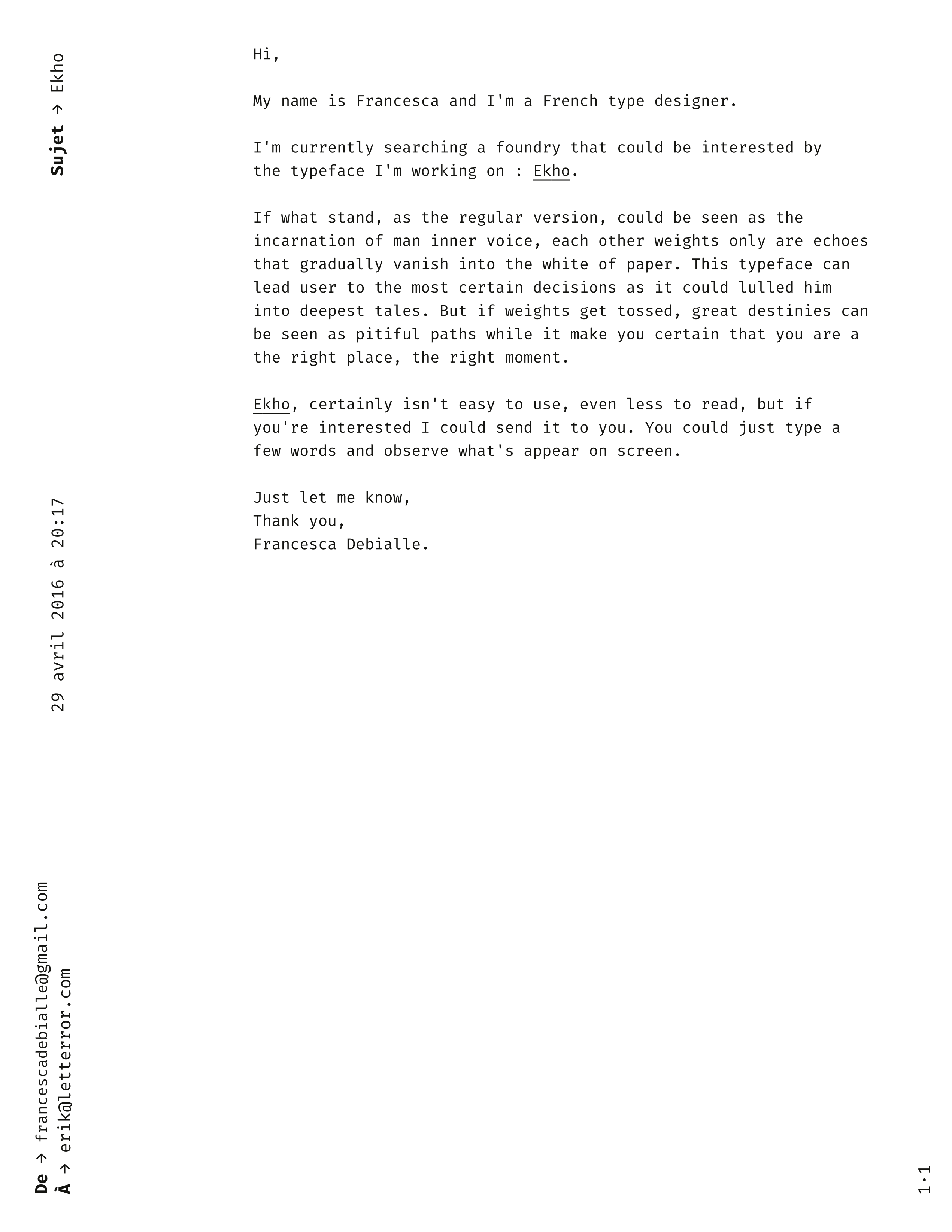
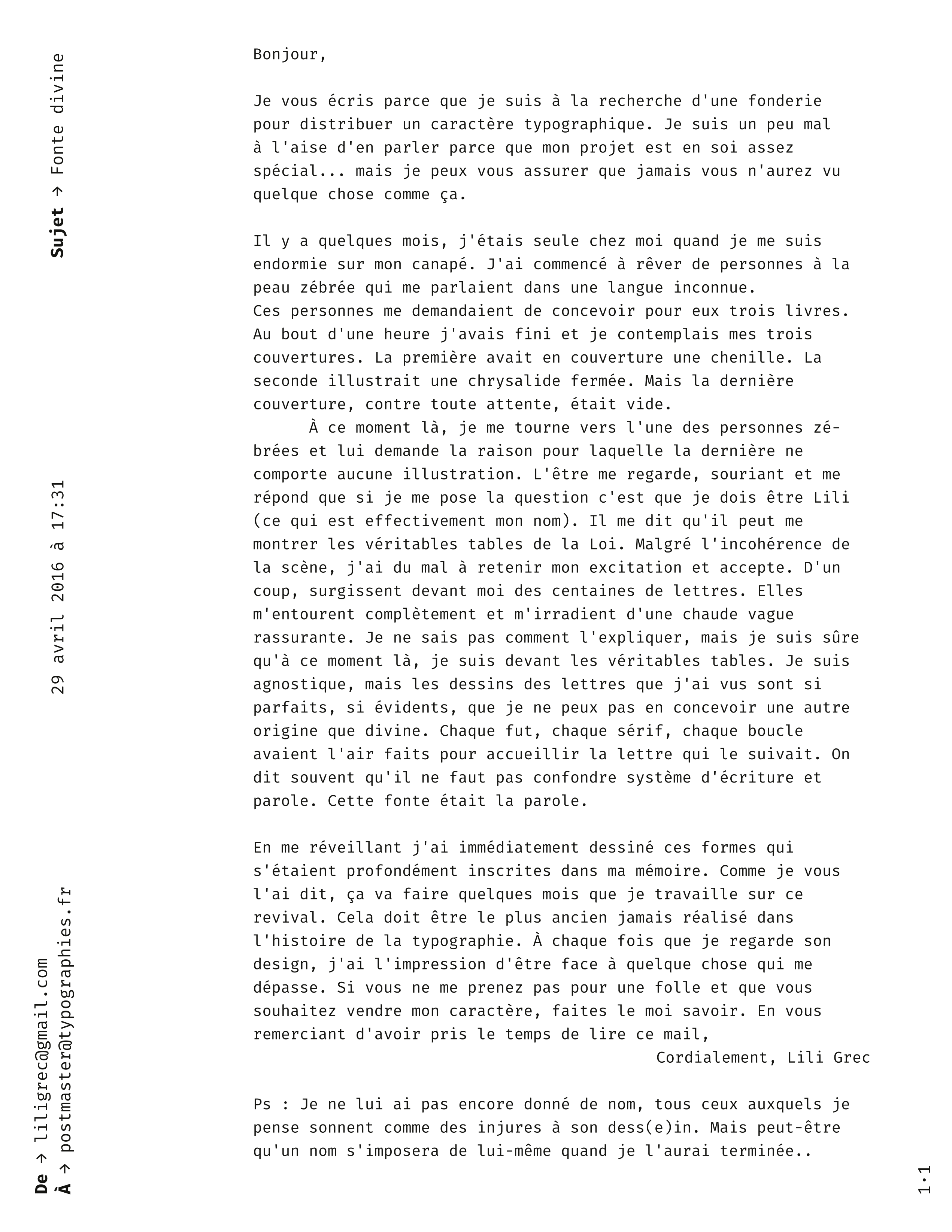
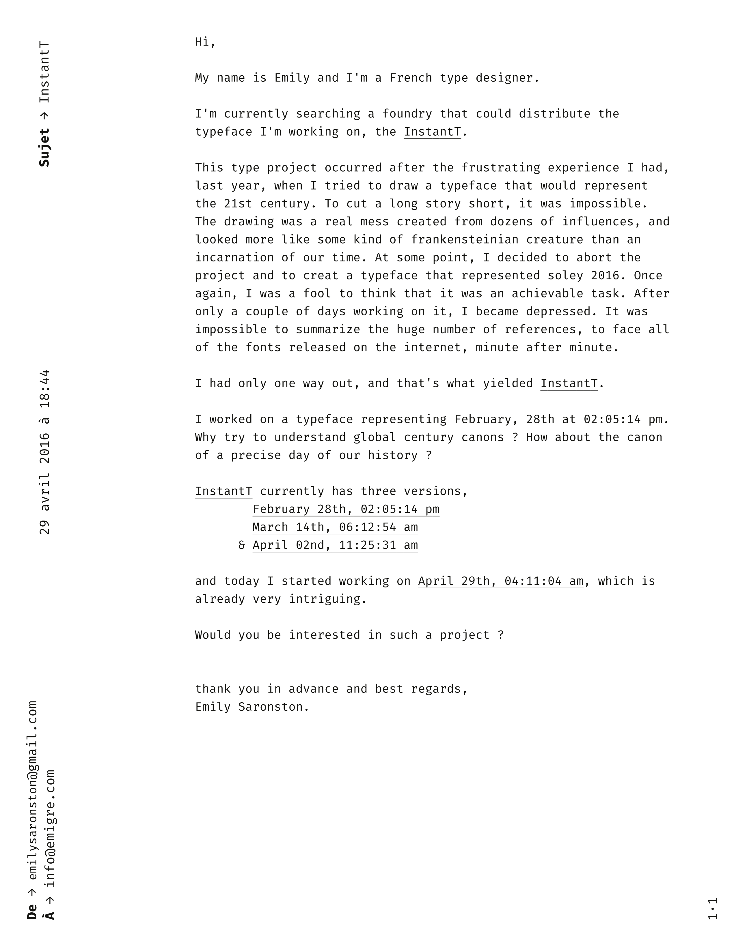
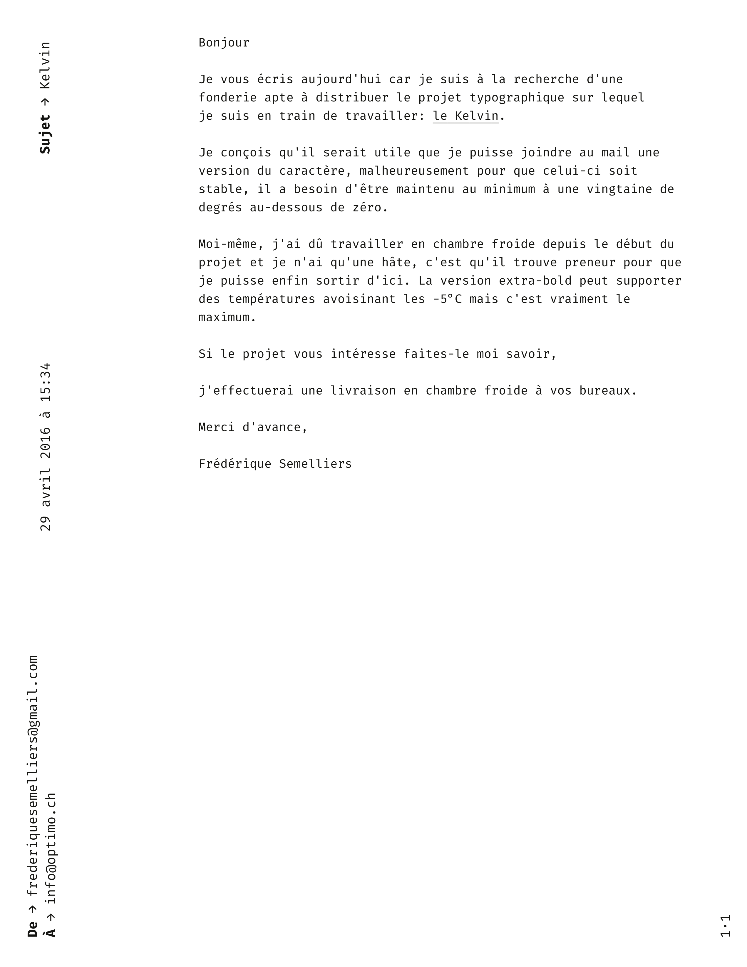
The form of the e-mail as a platform for works of fiction seemed to me to have a great advantage. Received in a professional setting and staged in a serious manner, it could make recipients doubt about its veracity and gives to the fantasized narrative the solidity of reality, forcing the designers to consider these shapeless characters as plausible. This illusion is even more convincing given the almost total absence of fictional texts with typefaces as the main subject, if we exclude the relatively recent About the typefaces not used in this edition,3 by Jonathan Safran Foer, published on the Guardian website.
The feedback from the foundries in reaction to my submissions were diverse. Most of the foundries were surprised, some of them were amused, while others never answered me. I myself never wrote back to the people I contacted, in order to keep the mystery unexplained, like a psychomagic aura hovering over this one-time act, as Alejandro Jodorowsky describes it: “A psychomagic act is like giving reality a loving kick in the butt. This surprising impulse you give it brings it out of inertia and makes it dance.” 4
In Comment tout peut s'effondrer 5 (How everything can collapse), a book about the great paradigm shifts we will go through in a post-oil society, Pablo Servigne and Raphaël Stevens invite us to nourish and multiply the common narratives of this post-collapse world, which are currently too often fantasized as a kind of frightening survivalist MadMax scenario. If we are all convinced that we will end up killing each other, we leave less chance for alternative futures to flourish. The same movement is possible in typography. Let's not be proud and think that we already know everything about the act of reading, and that there is nothing surprising left to discover in the text as an object, the materialization of thought through the choreographed dance of abstract signs. Let's multiply our attempts, and too bad if three quarters of them end up in oblivion. Let's search with joy, faith and without respite for our future functions worthy of the italics.
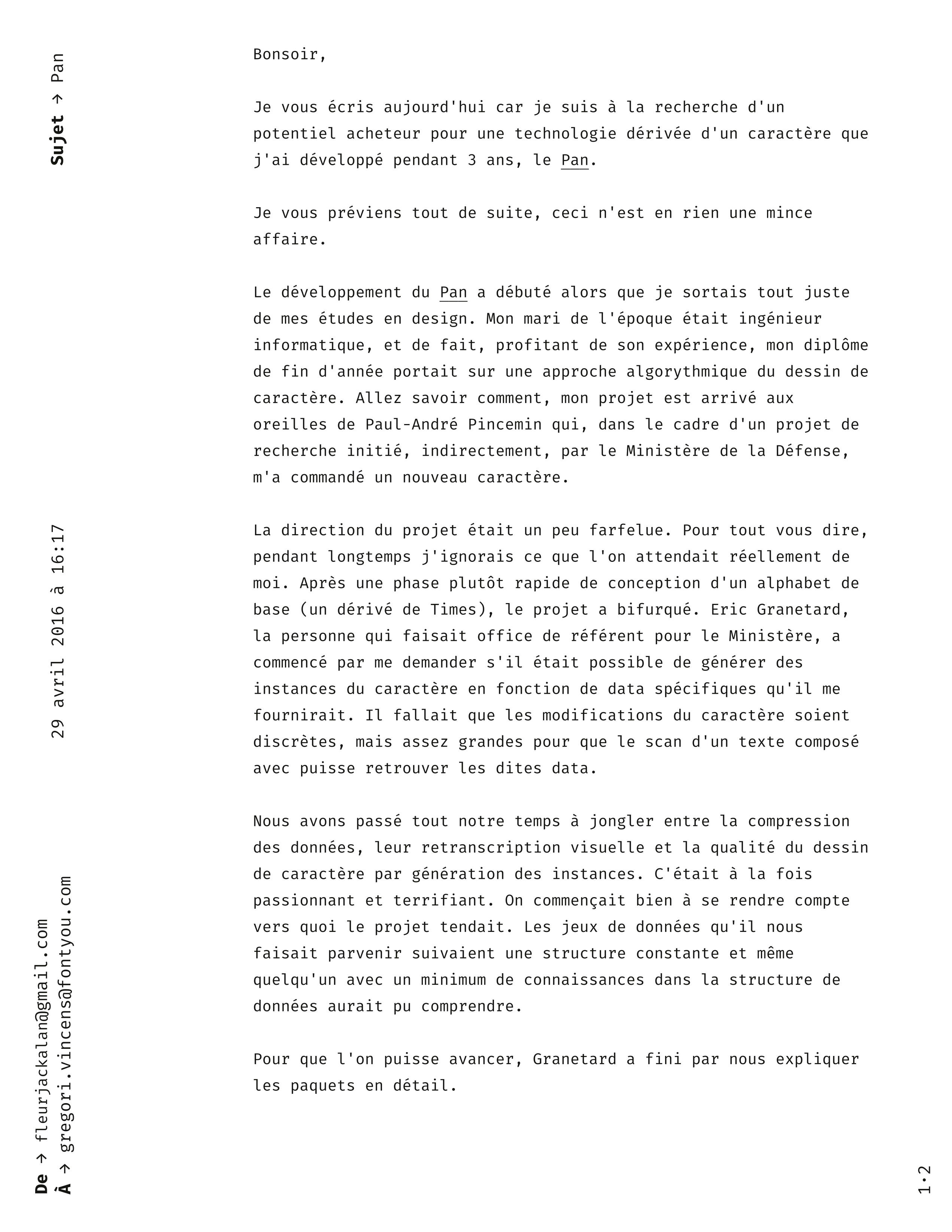
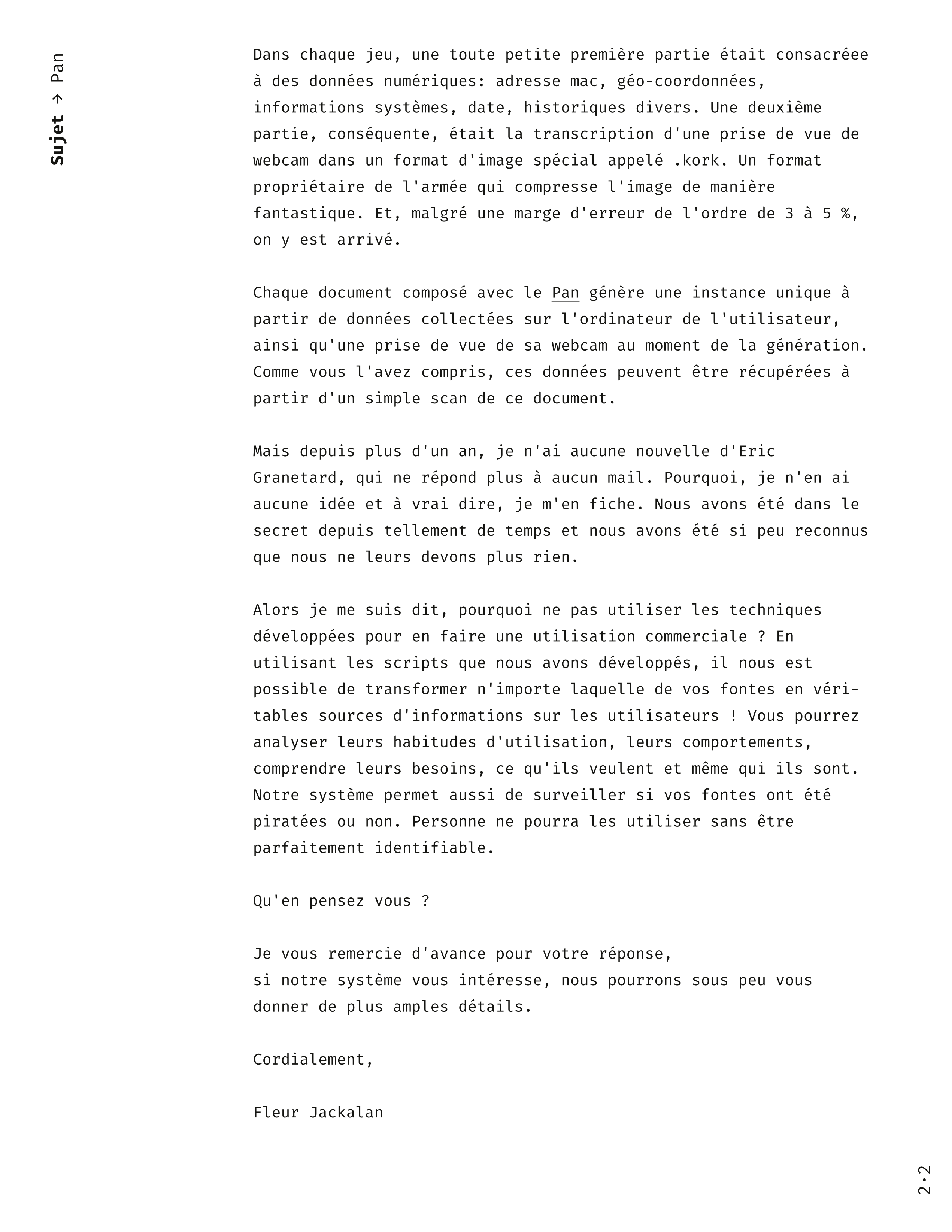
Here are all the letters sent to French foundries:
-
Arrival is an American film directed by Denis Villeneuve and released in 2016. The screenplay, written by Eric Heisserer, is adapted from a short story by Ted Chiang, The Story of Your Life. wikipedia ↩
-
This results from an extreme development of the Sapir-Whorf Hypothesis, which theorizes the idea that language has an influence on the way its speaker perceives the world. If the radicalness of the theory originally defended by Edward Sapir and then by his pupil Benjamin Lee Whorf has now been revised downwards, it is now accepted that language can have an effect, sometimes weak but nevertheless measurable, on the perception and representation of space, time and emotions. ↩
-
Pablo Servigne & Raphaël Stevens, Comment tout peut s'effondrer : petit manuel de collapsologie à l'usage des générations présentes, Edition du Seuil, Paris, 2015. ↩


