
Type : Article
Release : 09 September 2019
Auteur : Benjamin Dumond
pdf : mauvaise-pilule.pdf
apa : Dumond, B. (2019, 09 Sep.). Wrong pill. Grifi.fr. /en/articles/mauvaise-pilule
“Typography took the wrong pill” is a text written in 2019 for the website conjonction.org. With a slightly acerbic tone, the article attacks subjectively and somewhat simply the path to modernity taken by typography. It can't help but get carried away, fantasizing the idea that type designers might abandon their engineering posture in favor of a more poetic-mystical one.
In what we might consider its adolescence, sixteenth-century typography screwed up when it took the decision to decline the red pill it was offered. The result of this promising marriage – on the one hand that old and strange creature that is writing, and on the other hand the honest craft that is engraving – one would have thought that the bubbling of the first would have found in the efficiency of the second a catalyst capable of giving birth to an art of a well-deserved depth. But the paths taken are only very rarely those that one hopes for, and today everything leads one to believe that a creature sleeps behind lead bars constantly maintained by revival effect.
The Renaissance was an astonishing period in which esotericism managed, as much as other more rational disciplines, to find fulfillment in the scientific method. Complex systems, such as those of John Dee, touch upon treasures of experience that many poets and philosophers would have been willing to pay for with their lives. These mystical adventures that have always existed are our heritage and define us more deeply than we would think. Exerting their influence on society via lower strata, writing systems occupy the role of a formidable tool for exploring highly illogical lands.
However, after the Renaissance and the Industrial Revolution, irrationality becomes troublesome. Judged as cumbersome in our way of thinking, irrationality inefficiency opposed itself to markets. It is the advent of a new god, this demon of misery that sublimates greed in a totally new way. The emerging World Trade, adored by all the merchants of the temple, asks only one sacrifice in exchange for money, glory and territory: that of our propensity to the irrational. Nothing you’re gonna miss, right?
One of the main characteristics of capitalism is that it absorbs its enemies and makes them work for it. It is therefore difficult not to see very early on in the history of typography this phenomenon which begins by attacking what seems to be its most powerful opponents: language and writing, both of which have the power to shatter the vilest illusions in the snap of a finger, threatening the upper echelons of society with a possible state of revolution. The 19th century was the incubator of an effervescent typography, certainly, but strictly was monopolized by the communication market. By being the majority shareholder of the writing industry, it forged without opposition a line of conduct to be followed that seemed to be very quickly taken for granted. It surely still exists today in a new form, even in the independent models, continuing to serve the same interests. It is according to his terms that in 1929, Paul Renner sees his alternates being thrown away, and it is this line of conduct that tries to make us forget that the form of human writing does not have the right to frolic outside of its lands.
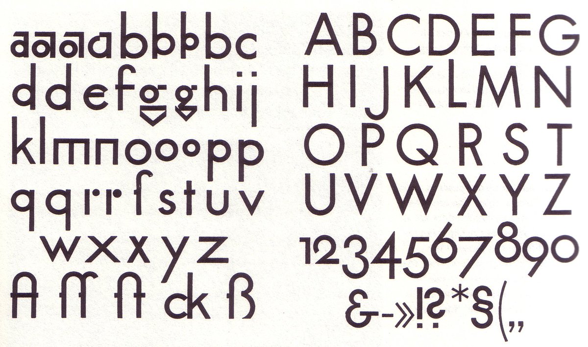
In 1929, Paul Renner proposed new forms for lowercase letters, in a less coarse way than his Bauhaus colleagues. However, due to a lack of financial interest, the foundry did not produce these glyphs for very long.
Galvanized by the modern era and its exponential spread, typography at that time followed the common aspirations, which seemed to work for the common good. It had to be adaptable, navigate towards the machines imposed on it without flinching, be legible and go for the simplest forms, dancing an infinite tango with mathematics. Analyzed, dismembered, tapered. Aware of the power of the text, the modernists made it their cutting-edge weapon and slowly transformed it into a small functional machine, greased with the elbow grease of entrepreneurs, so that more than ever it would be defined as the perfect tool of enlightenment for the guarantors of knowledge, of scientific faith and of truth. A zetetypographic science.
Since then, water has flowed under the bridge. Between the 1920s and the 2020s, some typographic experiments have consciously tried to place themselves at odds with this heritage. But have they really done so outside of this diabolical contract in which the form of our writing has been entangled for so many years? Anyone who has studied the history of typefaces knows what lies behind the mask of what we call our writing, which is far deeper and richer than the latest grotesque and botoxed version of Helvetica New. Anyone who lives in the 21st century can see that it is impossible to define typography as a mere mechanical emanation of writing. Typography is writing itself in a process of mutation, in its fluidity of evolution, which only asks to be distilled in unexpected ways.
Our characters are Pandora's boxes. Ancient, intangible, powerful, the force that resides in them goes far beyond the utilitarian aspect that we would like to attribute to it. Its chasms are abysmal and its borders full of surprises. Few are those who have not been afraid to go on a journey there, and Henri Michaux's paintings bear witness to a portrait of letters whose importance is matched only by Lovecraft's great ancients. They are factories of power, and their inclusion in our experience of reality endows us with a capacity that, though astonishingly strong, now seems natural for us. We consider them in the same way, whether they tell us of the greatest fictions or inform us of the list of components of a toilet paper roll.
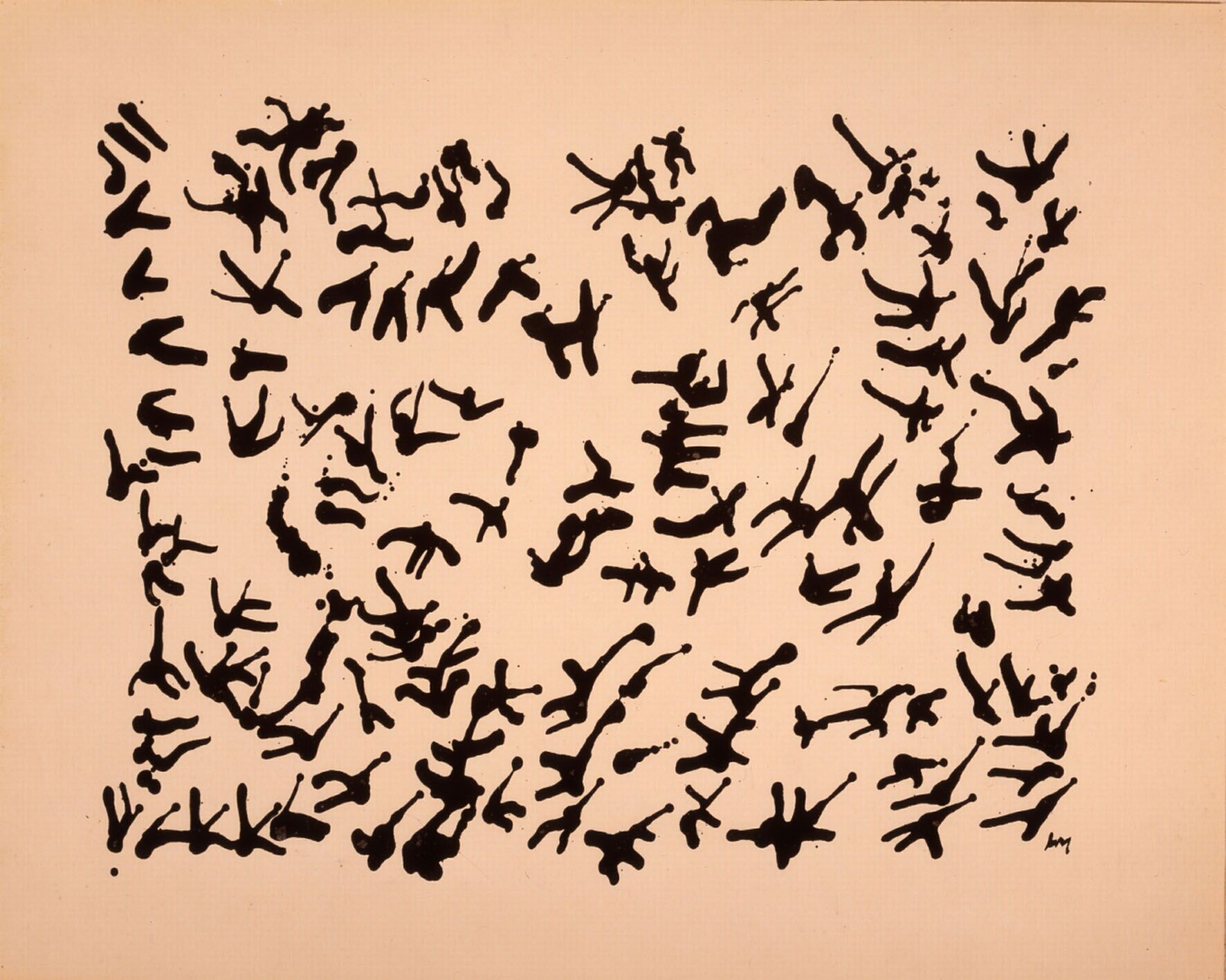
Sometimes while on drugs, but not only, Michaux spent his whole life scratching language and writing until bleeding, revealing uncertain territories.
So... what if, with foresight, typography had sensed this direction and decided to take a different path? What if, when we started to put a shirt and tie on it, it had answered ”no thanks, I prefer to eat magic mushrooms with my witch friends”? What if it'd taken the side of indefiniteness rather than definition (and to celebrate, a good split in classifications would be the best thing ever, wouldn't it)? In this upside-down world, we could say: ”Bye bye Alde start-up nation Manuce, hello Francesco Rambo Griffo”. Freakin' fonts that from the tips of their punches, can take life.
Writers know that texts can be labyrinthine meanders, fables of sphinxes that mercilessly take us by surprise, worlds that couldn't less care about the paradigms in which we ourselves live. How can it be, then, that such prodigies are embodied for the most part in such down-to-earth characters’ bodies? If letters have bodies, it is clear that they are denied transcendence. What is typography beyond what it is, that is the panacea that a contemporary Griffian punk would tackle. Internalizing the fact that it is one of the most fantastic human tools, the magic of a procession of consciously organized signs, at least 6,000 years old, and intimately linked to language, a mythical creature that is 100,000 years old?
It is a story that goes back to the seventeenth century and never appears in any book on typography, which opened the way to this reflection. Noted by Borges and Eco, it was a project carried out by John Wilkins, an English bishop and scientist, a high-ranking member of the Royal Society, who was present during its formation and was its first secretary. In a rapidly expanding and increasingly quantifiable world, where new languages are discovered every day, Wilkins wanted to embark on a rigorous adventure of which he was not the precursor: inventing a universal language and alphabet.
What makes this project unique, however, is that it is associated with another great name, Joseph Moxon, who will carve out of typographic lead what Wilkins humbly calls his Real Alphabet. Moxon is no stranger to those versed in typographic history, as he is the first person to have set down in print the definition of a typographer, as well as a complete description of the process of creating a typeface.
”By a Typographer, I do not mean a Printer, as he is vulgarly accounted, any more than Dr. Dee means a carpenter or mason to be an architect: but by a Typographer, I mean such a one, who by his own judgement, from solid reasoning with himself can either perform, or direct others to perform from the beginning to the end, all the handy-works and physical operations relating to typographic.“ Mechanick Exercises, 1703. London.
This paragraph, apart from the lovely incursion of the John Dee character who forever cast in stone the fact that an occultist is quoted in the first definition of a typographer, describes the profession as one who, by his own judgement and inner reasoning, directs the act of creating and using the form of letters. If with the post-modernists, the idea that a typographer can have the status of author has somewhat changed the archetype of the letter designer, he still remains mostly heir to a strong past as an engineer, an ultra-sharp worker there to solve problems. Here, however, it is not the engineer who is summoned but the architect who, unlike the engineer (who sees problems, solves them, and sees typography for what it is), also has the ability to see typography beyond what it is, and to orchestrate its means to make the non-existent come to life.
In 1662, John Wilkins decided to embark on the vast project of constructing a language and an associated script. He could have done as Dee did and ask the angels to give him the keys to the Adamic language, but he preferred the power of science, able to give birth to something perfect by logical reasoning. According to him, natural languages lack efficiency, and the incursion of scientific thought would allow humans to model a language according to new paradigms. If with hindsight we know today that this work could only fail (is a language that is not born of speakers anything other than an empty shell?), it emanates the fascinating aura of Dantean enterprises of invention, proper to Elvish and Klingon contemporaries. The project is only scientific in its expectations, yet its scope is mesmerizing. While in 1666 he lost part of his work in the great fire of London, two years later he published An Essay Towards a Real Character, and a Philosophical Language, a 670-page synthesis of his quest.
Wilkins' idea is to create a new function for language, to endow it with a new capacity. He wants to create a self-describing language, a language that would also be, in its structure, an encyclopedia of the world it describes. He wants those who master this dialect to be able, at a glance, to understand what the word means, to have a definition, just by its construction and form.
This idea, however, requires Wilkins to first classify everything in this world into a large flow chart. He will be helped in this task by other scientists, who will not stop arguing with him as he forces them to follow what he has in mind rather than letting experts in each field classify their discipline according to the latest discoveries. Everything will end up sorted into categories, sub-categories and sub-sub-categories (in his vocabulary: tables that are divided into differences, themselves subdivided into nine species). “Salmon” for example, is classified in the table of “fish”, the difference of «river fishes» and the species of “red-fleshed river fishes”.
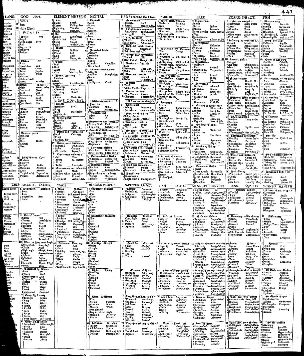
Part of the taxonomy of the Wilkins system
To each part and sub-part, he associates a syllable or a letter. The fish table starts with "Za". Any word beginning with "Za" is therefore certainly a fish. The subpart "river" is associated with the consonant "n" and the subpart "red-headed" is associated with the letter "a". A person well-versed in learning this language and who would have learned that the word Zana means Salmon would know at the same time that salmon is a red-fleshed river fish.
There are 40 major categories (then 9 differences, and 9 species), ranging from "Military" to "Spiritual" to "Metals". The sub-categories are all equally arbitrary (and sometimes don't go to 9), the "Rocks" are for example divided into vulgar (flint, gravel, slate), moderately prized concretions (marble, amber, coral), precious (pearl, opal), more transparent (amethyst, sapphire) and non-soluble terrestrial (charcoal, ochre and arsenic). Didi clear, isn't it?

Didi: A stone, moderately rare, transparent.
In its writing system, each word of this system is in the same way composed of three glyphs. One for its table, one for its difference, and one for its species. Originality, the words are built from the center, that is to say that the glyph of the main category is in the middle of the term, the glyph of the sub-category on the left, and on the right the one from the sub-sub category. Then, by a complex set of accents, Wilkins builds adjective, adverbial, antonymic or plural versions from these simple words. The whole system being too laborious to describe here, you can get an idea by going to pages 385 to 434 of his book.
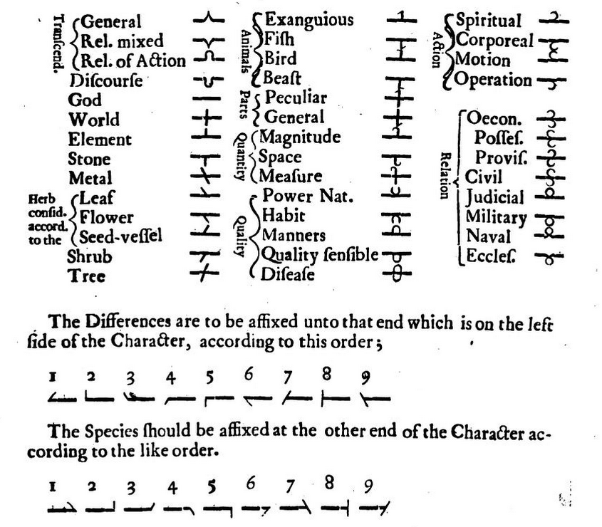
You can see all the matches here.
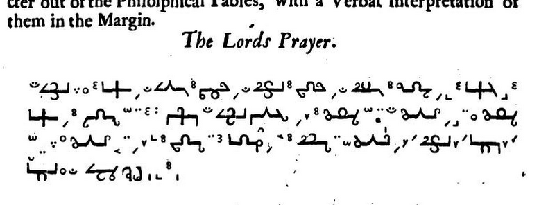
A pretty funky gospel.
Joseph Moxon has therefore carved a punch for each of these glyphs. The feeling when reading the book is quite strange. Contrary to an engraved, invented language (as we can have in Champfleury for example, with the Chaldean characters), which would smooth the visual aspect of the paragraphs, we can see here and there shifts between the letters, proof of their typographic workmanship. The design is one of measured simplicity. Built around a central line, the words contrast with the categorical dryness of the language. One has the impression of being in front of a talismanic cohort, a flock of little creatures that give the composed texts an exciting mystical aura. The text is stripped of the academic rigor present in the rest of the book, and suddenly becomes a teeming jungle, a dance of sigils and diacritical fireflies.
But let's resist being hypnotized by the forms, and let's not spend too much time analyzing the relevance of Wilkins and Moxon's project in an attempt to draw a useful lesson about what writing should be. What remains beyond the totalitarian desire to establish a common language and writing? What seems interesting here is that one must assume that such an enterprise is not simply the fantasy of its authors. Beyond that, it is the mark of resurgences of an intuition that the form of writing can be more than what it is. The great replacement of the Latin alphabet by glyphs from nowhere is tinged with a naivety that seems obvious to us today, but shows us that very early on, by the hand of Moxon, typography did not close the door to unknown paths.
If for some centuries the italic has allowed us, by a simple drawing, to invoke in its reading, deep within us, the consciousness of an external voice or of a foreign language, would not a fifteenth-century printer have laughed at the idea of the feasibility of such a text function? In the same way, a Chinese reader sees in each of his words, the concatenation of several others. Doesn't this give him a reading awareness quite different from ours? Is it so different from Wilkins who postulates the possibility of reading a word and understanding its definition at a glance? If his project, in its content and form, is off the mark, it is born of an irrepressible urge that we should try to listen to in order to finally lose ourselves once and for all.
The impasse in which contemporary typography, and ultimately the contemporary form of human writing, finds itself is that it is, for the moment, much more a place of measurement than a place of excess. Type designers are heirs to a philosophy of problem solving, where they could, instead, create problems. We should multiply questions whose outcomes seem highly uncertain, and make the form of writing a place of indefiniteness, not a place of definition. Counterintuitive as this may seem.
Thanks to the engineering rigor that had been in place until then, important parameters have already been identified. Movements have led generations of designers to follow each other, and if sometimes beautiful characters have shone like jewels, the great majority continues to dogmatically revere a tradition that prevents them from growing. In 1582, the angels allowed John Dee to create the Enochian alphabet. In the same year, Granjon completed the cutting of a set of Cyrilic leads. It seems to me that typography would benefit from thinking between these two extremes, rather than between Vier5 and Din.
Now is the time for poets, for manipulators of abstraction, always in motion, unaffected by rules. We need to expand, much more expand, what constitutes our working canvas, to the point where we end up seeing it vibrate, stuttering with new ideas. Type design needs to become an art to the point where some people are willing to sacrifice their sanity to make it happen, and think about type once and for all in a holistic way.
Writing, in its content and form, is a place of power. Its dogmas centralizes these powers, and it is necessary to become lucid on who benefits from it, to take the measure of the extreme necessity of counter-powers. In order to grow, typographic art would benefit from deconstructing itself to honestly let the biases of its history, the relationships of domination that it establishes between cultures, or in its sociological implications, appear. Each designer is responsible for the development of our writing to all humans, on his own scale.
However, the masters always manage to pull the collar when the dog pretends to do as he pleases. Today, the precariousness of the typeface designer's job (especially the freelancers since some foundries have been profitable for a long time) is one of the strings that calls to order those who would like to have the audacity to make a typeface that does not sell. For their part, graphic designers are tied down by software that tells them what their use should or should not be. We unconsciously allow ourselves to be limited in the manipulation of what is the solid form of the original medium.
What if, as we said before, we took back for ourselves these weapons that have been stolen from us for too long? It is certain that today, no one knows yet what strange abilities we would gain.


